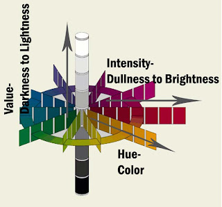
 Many people misunderstand the difference between hue, value and intensity. Hue is another name for color. For example the hue of Target's logo is red, the hue of broccoli is green and the hue of a polar bear is white. Though there may be many variations of the color within each of the items mentioned, the overall hue is true. The difference between the lightness and darkness of each of the colors is its value. Value is often stated as how light or how dark a color is. Pastel pink has a lighter value of red than burgundy. Pastel pink has much more white mixed into the red hue than burgundy and thus has a higher value. Not only does value matter with hue, but so does intensity. Intensity, or chroma, is the brightness or dullness of a color. Neon green has a much higher intensity than olive green. It is a much brighter color in comparison. Remember, when talking about value and intensity be sure to always use a comparison. In the diagram see all three in comparison to each other.
Apr 12, 2008
Hue, Value & Intensity
 Many people misunderstand the difference between hue, value and intensity. Hue is another name for color. For example the hue of Target's logo is red, the hue of broccoli is green and the hue of a polar bear is white. Though there may be many variations of the color within each of the items mentioned, the overall hue is true. The difference between the lightness and darkness of each of the colors is its value. Value is often stated as how light or how dark a color is. Pastel pink has a lighter value of red than burgundy. Pastel pink has much more white mixed into the red hue than burgundy and thus has a higher value. Not only does value matter with hue, but so does intensity. Intensity, or chroma, is the brightness or dullness of a color. Neon green has a much higher intensity than olive green. It is a much brighter color in comparison. Remember, when talking about value and intensity be sure to always use a comparison. In the diagram see all three in comparison to each other.

